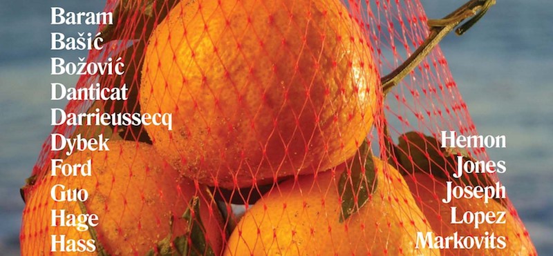
John Freeman: I’ve worked with you before on a brand (Granta) which was already well established. I’m curious how this differs, basically creating a visual identity from scratch.
Michael Salu: It was interesting trying to gather a starting point for the look of a new journal (Freeman’s). I supposed I’d begun with thinking about what might hook into the strong literary tradition of the journal and your own rather lucid, oak-distilled Americanness, if you don’t mind me saying? I wanted to create a feel to the journal that I suspect had quite a part in raising you and maybe get a touch of a bygone idea of America, but also create a fresh contemporary brand that could cloak the intended international perspectives that fill its pages.
So I began with looking at The Beat era, Ginsberg, Kerouac et al. Walker Evans and other artists from that era and the paraphernalia surrounding them during and soon after their respective heydays. I think of the scenes, the journals, the academic publications, the poetry and photography books. The typography of this time carries a certain robustness, directly inspiring the Freeman’s masthead. There’s such myth and movement through images more recently, so working with young photographers seemed an interesting way to go.
JF: Well you threw a bulls-eye dart there. I grew up driving distance from City Lights, which was my MFA and also how I found a more modern collision between aesthetics and ethics. Planet News could be a book for untruthy times. You’ve worked with me before though and must have known the journal would have a global list of contributors. How’d you figure you would signal that or do you feel like all the ways of signifying in that regard are too broken to employ?
MS: I’d say there’s a visual vernacular that’s universal. Particularly when it comes to magazines. It’s something we question little, the formula road-tested for optimal impact. The image as a signifier for something you want to or need to identify with. Using this formula in a literary context playing with that signification is I think a way to draw on the grouping of ideas you seem to aim at both now and before.
JF: One thing I know is you always wanted your covers to speak to readers’ intelligence and skepticism, can you give me an example of how that interaction grows out of questioning the vernacular you just described?
MS: I suppose I spend a fair amount of time examining the semantic data that exists within images, how they shape our narratives and there are certain strict codes we adhere to certainly for “commercial” purposes. What do they mean to the individual and our societal hierarchies? These codified archetypes of being, or saying that we imbibe and occasionally those life myths are disturbed and we struggle to react. Thinking about Charlie Hebdo and the recent Trump cover by Der Speigel, yet the likes of Vogue arguably carry more power as their tropes of propaganda are consistent and far-reaching. I’ve always been interested in subverting those codes. Remember Granta 110 and 115? In fact I’ve always wondered how you read images given your granular engagement with words.
(…)


