Category: Art world

The Painter and the Novelist

Paul Levy for The New York Review of Books

Paul Levy writes on the Bloomsbury painter Vanessa Bell and her younger sister, Virginia Woolf, for The New York Review of Books.

The Bloomsbury painter Vanessa Bell, née Stephen, lived most of her life (1879–1961) in the chilly, concealing shade of her younger sister, Virginia Woolf—the last twenty years following Virginia’s suicide in 1941. Though the attention paid to the Bloomsbury Group seems to be waning on both sides of the Atlantic, there is currently a surge of interest in Bell. Priya Parmar’s novel Vanessa and Her Sister artfully sheds new light on Bell, who is also part of an imaginative group exhibition, “Sussex Modernism: Retreat and Rebellion,” at Two Temple Place in London (William Waldorf Astor’s townhouse, now an exhibition venue). Dulwich Picture Gallery (England’s earliest public art gallery constructed for that purpose) has mounted the first major exhibition of Bell’s work. Her sex life was the chief subject of the BBC series Life in Squares (2015); she was played at different ages by Phoebe Fox and Eve Best.

In 1907, Vanessa married Clive Bell, the art critic and father of her two sons; she briefly became the lover of Roger Fry, the highly admired art critic; and she was the lifelong companion of the gay painter Duncan Grant, whose work will be featured in Tate Britain’s exhibition “Queer British Art, 1861–1967,” opening in April, and who was the father of Bell’s daughter, Angelica. Posterity has judged Virginia the greater artist, but in Parmar’s fictionalized account, Vanessa is the nobler, more sympathetic of the Bloomsbury Group’s founding sisters.

Was Bell a good painter? The striking catalog for the Dulwich show (of seventy-six paintings, works on paper, and fabrics, as well as photographs by both her and Patti Smith) equivocates by stressing her place in art history, saying that she was “one of the most advanced British artists of her time, with her own distinctive vision, boldly interpreting new ideas about art which were brewing in France and beyond.” Nancy Durrant, an art critic for the London Times, agrees: “This show is a joy…. What a magnificent creature she must have been.”

(…)

At Tate Britain

Nicholas Penny for the London Review of Books

Nicholas Penny on Ford Maddox Brown and some of the little-known masterpieces at the Tate Britain. 

Roger Fry, when comparing the Pre-Raphaelites with the Impressionists, described the artistic innovations of the former as an insurrection in a convent, whereas the latter were real revolutionaries. The simile may have been unconsciously prompted by an elaborate and highly finished drawing of hysterical nuns entangled with fanatical Huguenots who are disentombing the body of Queen Matilda. This drawing by the young Millais is currently on display in an exhibition at Tate Britain of Pre-Raphaelite works on paper (until 7 May). The calculated confusion of rigid and angular figures, although it owes something to the medieval art cherished by the nuns (some examples of which feature in the background), can’t simply be dismissed as revivalism. Such a thorough determination to avoid being in any way easy on the eye or the mind may once have seemed a peculiar by-product of the reactionary antiquarian ecclesiology of the late 1840s but it now seems to anticipate (although it clearly didn’t influence) the daring aesthetic discomforts devised by ‘Modern British’ artists, even the wiry, tortured sculptures of a hundred years later by Lynn Chadwick or Reg Butler.

This drawing, and the finished study by Millais for Christ in the House of His Parents (also of 1849) which hangs beside it, are familiar enough to students of British art, but the exhibition, which has been very little publicised and is rather hidden away at the east end of the Clore Galleries, includes several little-known masterpieces. The most startling of these is Ford Madox Brown’s watercolour of 1863, entitled Mauvais Sujet, of a young teenage girl who is not so much engagingly naughty as alarmingly bad. The tight format derives from Rossetti’s early oil paintings of female heads and shoulders, such as Bocca Baciata of 1859, paintings of a frank sensuality free of the narcotic eroticism and religiosity that make so much of his later painting seem repellent. But Brown’s schoolgirl subject hasn’t yet led any artist into temptation. She is seated at a high desk with names and doodles scratched on its hinged top. We see the lines she has been made to copy with her quill, black lines which rhyme with the disorder of her hair. Her teeth – brighter than the white of her collar, the plume, the paper or the enamel inkwell – are biting into a brilliantly green apple. Fruit would certainly not have been allowed in the classroom and this young Eve, whose dress is also green, eats it with resentful defiance. The picture has the compositional ingenuity and thrilling compression of Brown’s great circular painting The Last of England – a compression, here greatly enhanced by the original double frame, that we miss in his later work, although he was always attracted both by defiance and by teeth.

(…)


Raucous, Disorderly Downtown

Richard Hell for The New York Review of Books

Richard Hell writes on artist-run galleries in New York during the 50s and 60s

Following the mid-twentieth-century triumph of New York’s Jackson Pollock, Willem de Kooning, Mark Rothko, and their cohort of Abstract Expressionists and Color Field painters, what could the next generation of American artists do? New York had become the new capital of art after a hundred years of Parisian dominance: Could we sustain? “Inventing Downtown: Artist-Run Galleries in New York City, 1952–1965,” an exhibition at NYU’s Grey Gallery (through April 1), captures the fertile tumult of this period.

The focus of “Inventing Downtown” is not on a type or trend of art-making, but rather on an inclusive range of galleries, fourteen of them, formed by artists for themselves in storefronts, lofts, and church basements. The galleries were downtown, mostly in the Lower East Side, because that’s where rents were cheap and where the artists lived. (Commercial galleries were in midtown.) Most of the artists were young. Some of them would become famous, most not. Melissa Rachleff, the show’s curator and author of its exceptional catalog, gives us a rare presentation of the robust roots of art-making, rather than only the flowers.

The Grey Gallery rooms are a patchwork miscellany of wildly various works, but Rachleff has adeptly organized the disorder. She divides the fourteen galleries into five categories. The first, “Leaving Midtown,” focuses on three galleries, two of them among the earliest and longest-lived, the Tanager (1952–1962) on East Fourth Street, and later East Tenth Street; the Hansa (1952–1959), named for influential Abstract Expressionist teacher Hans Hoffman, on East Twelfth Street and later Central Park South; and the Brata (1957–1962) on Tenth Street—all of which were pure artist run co-ops, financed by dues-paying member artists, which showed their members’ work and that of others they deemed interesting. The artists—such as Lois Dodd, Philip Pearlstein, Jean Follett, Allan Kaprow, Ed Clark—range widely in both aesthetic aims and levels of eventual renown. Most show the influence of de Kooning and, to a lesser extent, Pollock.

(…)

Secrets of the Designers: On Creating the Look for a Literary Journal

John Freeman writing for LitHub

John Freeman in conversation with Michael Salu about the conception of a literary journal’s visual identity, for LitHub:

John Freeman: I’ve worked with you before on a brand (Granta) which was already well established. I’m curious how this differs, basically creating a visual identity from scratch.

Michael Salu: It was interesting trying to gather a starting point for the look of a new journal (Freeman’s). I supposed I’d begun with thinking about what might hook into the strong literary tradition of the journal and your own rather lucid, oak-distilled Americanness, if you don’t mind me saying? I wanted to create a feel to the journal that I suspect had quite a part in raising you and maybe get a touch of a bygone idea of America, but also create a fresh contemporary brand that could cloak the intended international perspectives that fill its pages.

So I began with looking at The Beat era, Ginsberg, Kerouac et al. Walker Evans and other artists from that era and the paraphernalia surrounding them during and soon after their respective heydays. I think of the scenes, the journals, the academic publications, the poetry and photography books. The typography of this time carries a certain robustness, directly inspiring the Freeman’s masthead. There’s such myth and movement through images more recently, so working with young photographers seemed an interesting way to go.

JF: Well you threw a bulls-eye dart there. I grew up driving distance from City Lights, which was my MFA and also how I found a more modern collision between aesthetics and ethics. Planet News could be a book for untruthy times. You’ve worked with me before though and must have known the journal would have a global list of contributors. How’d you figure you would signal that or do you feel like all the ways of signifying in that regard are too broken to employ?

MS: I’d say there’s a visual vernacular that’s universal. Particularly when it comes to magazines. It’s something we question little, the formula road-tested for optimal impact. The image as a signifier for something you want to or need to identify with. Using this formula in a literary context playing with that signification is I think a way to draw on the grouping of ideas you seem to aim at both now and before.

JF: One thing I know is you always wanted your covers to speak to readers’ intelligence and skepticism, can you give me an example of how that interaction grows out of questioning the vernacular you just described?

MS: I suppose I spend a fair amount of time examining the semantic data that exists within images, how they shape our narratives and there are certain strict codes we adhere to certainly for “commercial” purposes. What do they mean to the individual and our societal hierarchies? These codified archetypes of being, or saying that we imbibe and occasionally those life myths are disturbed and we struggle to react. Thinking about Charlie Hebdo and the recent Trump cover by Der Speigel, yet the likes of Vogue arguably carry more power as their tropes of propaganda are consistent and far-reaching. I’ve always been interested in subverting those codes. Remember Granta 110 and 115? In fact I’ve always wondered how you read images given your granular engagement with words.

(…)

One Take: Incoming

Christy Lange for Frieze

Writing for frieze, Christy Lange takes a look at Richard Mosse’s latest video installation that peers at the refugee crisis through an alien lens.

There are a few scenes in Richard Mosse’s new video installation, Incoming (2017), where you can see photo-journalists or news camerapeople chasing down the unfolding action or holding their lenses steady to catch the decisive moment. Mosse, on the other hand, spent two years filming the same events with a camera that was too large to hold, had no aperture to see through and was difficult to focus. Designed by a weapons manufacturer, the thermal camera Mosse used to document the migrant crisis for Incoming is built to capture heat signatures – in black, white and shades of grey. It weighs 23 kilogrammes, and is meant to be operated remotely by a laptop. As Mosse puts it: ‘The camera is designed to stand on a sentry pole in the middle of the desert,’ detecting a human body’s heat from up to 30 kilometres away for surveillance or targeting. Together with his cameraman, Trevor Tweeten, and the camera’s original designer, Mosse adapted an Xbox controller to operate it and an old Steadicam mechanism as support. As an apparatus designed for surveillance, the thermal camera represents part of the spectrum the human eye cannot see and, as such, is an apt metaphor for the vast and ungraspable refugee crisis – the lives that ‘register’ but are not ‘seen’.

The 52 minutes of footage that comprise Incoming, slowed down from the camera’s 60 frames per second to 24 frames per second, is by turns lyrical and vivid, harrowing and violent. The action unfolds across three large screens – from one screen at a time to two, then all three simul-taneously. Much like his previous endeavour, The Enclave (2013), which Mosse filmed in the eastern Congo with outdated infrared film, originally designed for military use, the photographic technology presents inherent challenges and unintentional aesthetic call backs. In The Enclave, the infrared film responded to chlorophyll in plants to make the jungle’s green foliage look bright pink. In Incoming, the thermal camera also works an extra-sensory tool to perceive thermal radiation, rendering it black on white or white on black. It allowed Mosse and his team to detect missiles landing in Aleppo from the other side of the Turkish border, ships sinking in the Aegean Sea miles offshore, and gunmen and refugees being smuggled at night. The otherworldly footage evokes the sense that we are watching the action covertly, as if through night-vision goggles; it’s a rare glimpse through the mechanized tools of surveillance used by states and militaries to view us. When we do see close-ups of faces, noses appear like indistinct white blobs and eyes are dark pits. Humans become fleshy targets susceptible to the camera’s weaponized gaze. It’s a representational device that draws powerful parallels between the act of documentation and surveillance.

(…)

Know Your Place

Dan Fox writing for Frieze

From blue collar to new affluence, Dan Fox tackles the issue of social class in the art world, for Frieze magazine:

Hyde Park, London. It’s 5 July 1969 and the artists Gilbert & George are walking through the crowd at the Rolling Stones’ concert in tribute to band member Brian Jones, found dead in his swimming pool two days earlier. In a photograph taken for the Daily Mirror newspaper, the artists are captured wearing light-toned suits, shirts and patterned ties, with carnation buttonholes, as if they are attending a society wedding. Yet, they look uncharacteristically dishevelled: ties askew, hair blowing in the breeze. Leslie Woodhead and Jo Durden-Smith’s documentary of the day’s concert, The Stones in the Park (1969), shows hundreds of flower children basking in the sunshine under the fractious eyes of the Hell’s Angels security detail. Amongst them, Gilbert & George look like bankers from an alien planet, there to out-freak the underground freak scene. One detail makes them fit in: metallic body paint on their faces and hands, which looks like badly applied fake tan. Yet, their mimicry of conservative British masculinity still manages to wrong-foot expectations of how artists or other creative types associated with old-fashioned avant-gardism should present themselves.

Gilbert & George costumed themselves as urbane gentlemen of the upper classes, but lived in a then-run-down area of east London. Their suits afforded them invisibility: a cloak of conformity that allowed them to forge ahead with their extraordinary project to make their lives into a total artwork. It was a look that, paradoxically, made them stand out amongst their peers in Swinging London because it suggested that nothing could be more conformist than growing your hair and slipping on a kaftan. But, more to the point, in class-neurotic Britain, their appearance gave the lie to assumptions as to which social bracket artists should dress for. Gilbert & George punctured a self-flattering affectation of blue-collar solidarity that persists amongst certain artists: the fantasy that artists are workers in the same way builders, firemen or mechanics are. (In her 1977 essay ‘The Pink Glass Swan’, Lucy Lippard describes artists who are ‘persistently working “up” to be accepted, not only by other artists, but also by the hierarchy that exhibits, writes about and buys her/his work. At the same time, s/he is often ideologically working “down” in an attempt to identify with the workers outside of the art context.’) Were Gilbert & George rich or poor? Upper-class toffs on the skids or lower-middle-class clerks on the rise? It was hard to tell.

That was, I suspect, the point. George was brought up by a single mother and worked a number of jobs in London – in Selfridges department store, as a barman at the Players’ Theatre Club – before meeting Gilbert at Central St Martin’s School of Art in 1967. Gilbert came from a family of shoemakers in a village in the Italian Dolomites. Did that matter? Certainly, gaming the visual codes of the British class system was folded deep into their artistic strategies. It was a way of making us laugh when they called themselves George the Cunt and Gilbert the Shit for their 1970 ‘magazine sculpture’, or when we watched them get tight on gin to the music of Edvard Grieg in their 1972 video Gordon’s Makes Us Drunk. For many artists from the UK, class is inescapable – a facet of work and identity. In 1990s Britain, artists such as Tracey Emin and Sarah Lucas actively played up their backgrounds. Tabloid headlines were appropriated to redefine conversations around female sexuality. The British working-class seaside holiday or the souvenir shop were used as tropes to talk about ownership and independence: in 1992, Emin and Lucas bought a beach hut in Whitstable and, the following year, they ran a shop together.

(…)

The Banana That Conquered the World

Daniel Fernández Pascual and Alon Schwabe

A history of Musa Cavendishii Bananas, ‘from decorative wallpaper to the ships of United Fruit Company’, by Daniel Fernández Pascual and Alon Schwabe, for Tank magazine.

One of the largest wallpaper compositions in history depicts a voyage to a series of imagined landscapes. Sauvages de la mer Pacifique, a large-scale diorama designed by Jean-Gabriel Charvet and produced by Joseph Dufour in the early 19th century, recreates the overseas journeys of Captain James Cook. It brought the faraway “exotic” back into the bourgeois salon, and compressed a round-the-world journey and the hundreds of different peoples, plants, rocks and animals that Cook encountered along the way, into a flattened unified version, an amalgamated summary of the Pacific at large. Tahitians, Hawaiians, Vanuatuans, Tongans, Easter Islanders, were all put together into a single wall-sized cross-section of the planet that primitivised and homogenised the social complexity and diversity of a long-inhabited ocean.

At the very centre of the wallpaper, there is a banana plant, growing among the different peoples, as if that tree were the crucial element to be communicated to the ignorant Europeans looking for the first time at the Pacific. Regardless of the violent massacres that were happening at the same time to “discover” and “civilise” all those savages, the banana tree epitomised the fantasy of the journey to a remote, bloodless paradise.

Joseph Paxton, a gardener to the aristocracy, and later the architect of the Crystal Palace, became fascinated with bananas. When he first saw the plant depicted on the chinoiserie wallpaper in one of the rooms at Chatsworth, the Duke of Cavendish’s Devonshire estate, his reaction was to imagine the architecture that would help him actually grow bananas in the colder latitudes of northern Europe. In the 1820s, his contemporary Dr. Nathaniel Bagshaw Ward had just invented the Wardian Case, a portable device that made possible the transportation of exotic species from the Pacific. This eccentric prototype of a sealed terrarium, consisting of a box with glass walls, could confine tropical plants under controlled humidity and temperature, protecting them from the harsh conditions of the voyage on the long way back to Europe. Joseph Paxton took this idea and expanded it into large-scale structures. He developed the first greenhouses that could host those travelling plants permanently, keeping the warmth of the sun inside. People in Europe would no longer need to travel for months if they wished to experience exuberant botany. It was suddenly brought directly back to them in three dimensions, just as the Sauvages de la mer Pacifique had previously done in two.

(…)

David Hockney reveals what life is like in his Los Angeles studio

Martin Gayford in conversation with David Hockney in It's Nice That

With only a week to go until the opening of David Hockney’s show at the Tate Britain, we look back to Martin Gayford’s conversation with the artist in It’s Nice That.

In Los Angeles, the studio is the centre of Hockney’s world. It is the place where he spends most of his waking hours. The structure, built higher up than the house and at a slight angle, is much smaller than the one in Bridlington, but still a big room, high and spacious, with an upper gallery at one end and comfortable chairs disposed on the floor.

On most days Hockney goes there after breakfast, stays until lunch, and usually returns in the afternoon following a rest. For him it is as much a place for thinking as for working. On the walls are hung pictures in progress and also finished ones, in arrangements that frequently change. It is a private exhibition of very recent work, out of which the next pictures, yet to be made, will grow.

DH: I sit in the studio a lot, just taking in the pictures. I like being in here. A bed in the studio would suit me. It would be great. You need to do an awful lot of looking. I think unless you do that, you’re not going to “get” a lot of things.

MG: A studio is a place for looking, and also a place for thinking about looking. And there is a tradition of paintings about studios, which are therefore pictures about the act of making pictures and in a way about what pictures are.

DH: Yes, for example, Vermeer’s Art of Painting is a painting about sitting in the studio and looking. It shows Vermeer at an easel in front of you, painting it. There are paintings of studios by Braque, Matisse, Picasso, and many others.

In the early summer of 2014, Hockney’s interest metamorphosed again. By that stage, he had produced over fifty portraits in the Comédie humaine series. Then, he began to paint groups of people in his studio, who were also the sitters for some of the portraits, gazing at the paintings on the wall (which of course were created in this same space).

MG: The new series started as pictures of people looking at pictures, which suggests that they are paintings about looking and pictures about pictures.

DH: Yes, they are. The earlier groups are people in conversation, or just contemplating something. I had them all posing simultaneously at the start. The largest group is of eleven people. So I’m putting the people in the space, and then looking at them.

MG: It is actually very unusual, historically, to paint multi-figure compositions like this from life in that way. The normal procedure from the Renaissance onwards has been to study each figure separately, then fit them into a space. You are doing it all at once.

DH: Yes, I am. Rodrigo Moynihan did a large figure composition of the Penguin editors at a supposed cocktail party After the Conference, 1955]. But because there was a large number of people involved, he filmed it, then took stills. That was a terrible idea. A filmed picture – like any photograph – will only have one perspective. In real life when you are looking at ten people in a room there are a thousand. Because the moment the eye moves, it changes. That’s what real life is. The eye moves all the time. When my eye moves in one direction, the perspective goes that way. So it’s constantly changing with my eye.

MG: In a sense, what you are doing with these group paintings is putting yourself in the picture. Everything is seen from your viewpoint, which is inside the picture space, not outside it, as a normal photograph or single-point perspective picture would be.

DH Yes. There’s a weird spatial thing going on which seems to me to be about the centre of the picture, not the edges. In these groups, there’s a general perspective for the room but also for each person, because I’m looking at them. In fact, they may have several. If a figure is close to me, I am seeing his face head on, but also looking down at his feet. So you are moving in to view just that one individual. Then, you have to turn to look at another person, if he is close too. You cannot actually see both at the same time. In moving, you see another figure, then another. You make space through time, I think. And the space between where you end and I begin is the most interesting space of all. It’s far more interesting than outer space.

(…)

Susan Sontag: Critic and Crusader

Steve Wasserman in the LARB

Over 10 years since Susan Sontag’s death, Steve Wasserman recounts his relationship with her and her relationship to everything (Sontag’s ‘exemplary effort to swallow the world’); a transcription of a lecture, published in the Los Angeles Review of Books.

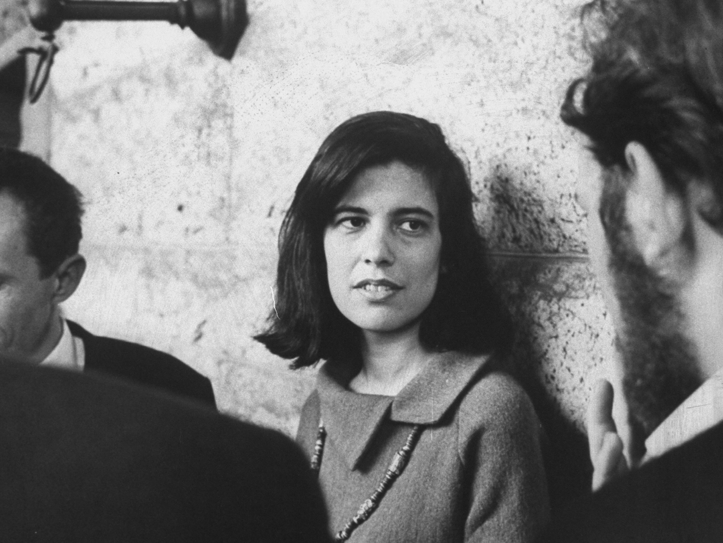
I FIRST MET Susan Sontag in the spring of 1974 at a dinner in Berkeley given by Robert Scheer, author of one of the first pamphlets against the Vietnam War and former editor of Ramparts, the radical magazine for which Susan had written in the late 1960s. I especially remember a 15,000-word “Letter from Sweden,” which began with a sentence I never forgot: “The experience of any new country unfolds as a battle of clichés.” I was then a senior at the University of California and was moonlighting as Scheer’s researcher on a book he was writing on multinational corporations and a growing phenomenon that years later would be called “globalism,” but which at the time was more familiarly known to those on the left as “imperialism.” I was to graduate in June, and Scheer and I planned to go to New York to finish our work on the book. Scheer was to bunk with his old pal Jules Feiffer, the gifted cartoonist for The Village Voice, and I would repair, at her invitation, to Sontag’s penthouse, Jasper Johns’s former studio, located on the Upper West Side at 340 Riverside Drive.

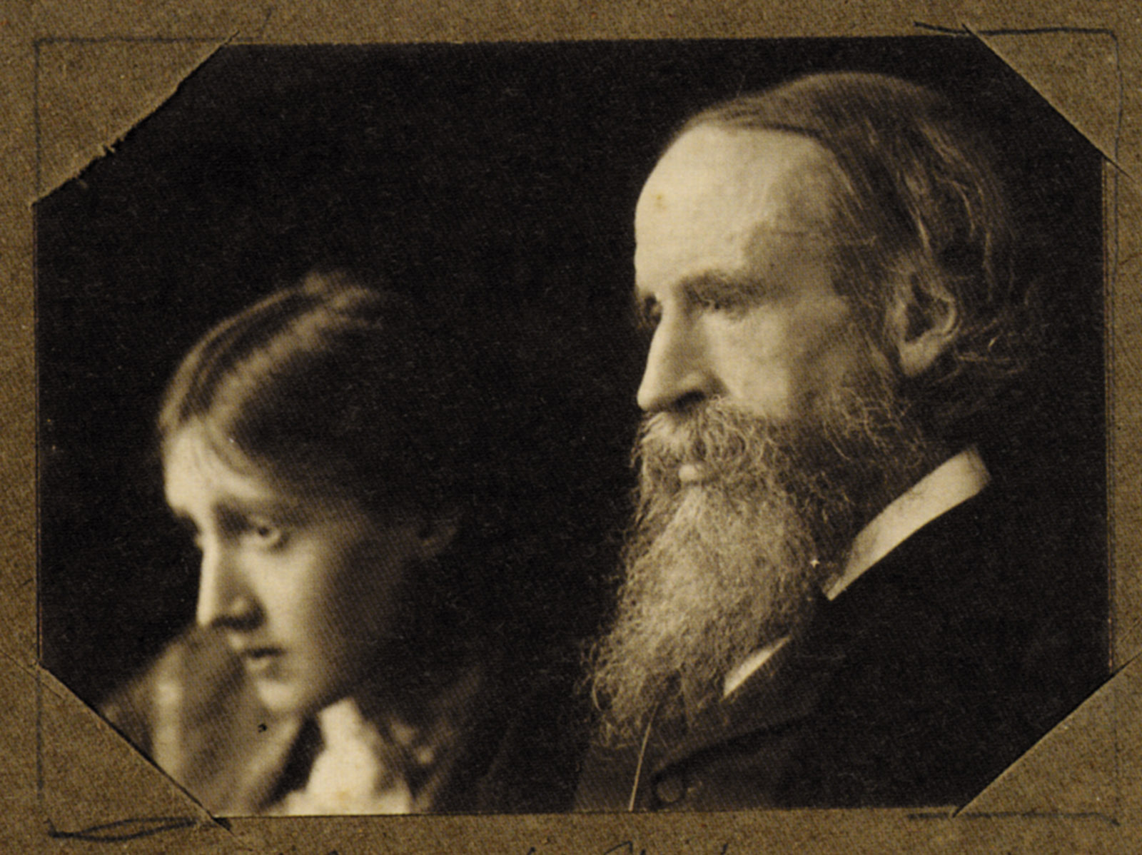
I remember the apartment well. Flooded with sunlight, surrounded by a generous terrace overlooking the Hudson River, it was spartan: hardwood floors, white walls, high ceilings; in the living room a single Eames chair, an original Andy Warhol of Chairman Mao; in the dining room a long monk’s table made of oak with a brace of long benches on either side; in the kitchen’s cupboards a stack of plates, a few glasses, and row after row of back issues ofPartisan Review; leaning against one wall of Susan’s bedroom a curious stained-glass window from Italy of a spooky Death’s Head, a kind of memento mori, and, perhaps most impressive, by her bedside atop a low nightstand a 24-hour clock featuring time zones spanning the globe. Most important, of course, were the walls that bore the weight of her 8,000 books, a library that Susan would later call her “personal retrieval system.” (By the time of her death, 30 years later, the library had grown to 25,000 volumes.)

I spent the summer nearly getting a crick in my neck from perusing the books, and I remember thinking that — though I had just finished four years of college — my real education had just begun. I discovered scores of writers I’d never heard of as well as writers I distantly knew but had never read. For reasons wholly mysterious, I found myself drawn to four blue-backed volumes: The Journals of André Gide. These, like others in Susan’s library, were filled with her lightly penciled underlinings and marginal notes.

For my 22nd birthday in early August, Susan took me to see Waylon Jennings at the Bottom Line, the hot new club that had opened to great success six months earlier. (Five years later, I would return the favor by taking her to see Graham Parker & The Rumour at the Roxy in Los Angeles.) Her son, David Rieff, my age exactly, had long been besotted with country music and boasted a dazzling collection of bespoke cowboy boots, and we spent many humid evenings walking his dog, Nu-nu, an Alaskan husky with Paul Newman eyes, through the streets of the neighborhood, while talking politics and literature and the higher gossip over endless cups of espresso and smoking Picayunes, the strong unfiltered cigarettes he then favored but would later give up. Thus was a lifelong friendship forged.

Six days later, President Richard Nixon resigned in disgrace. Scheer’s book had to be retitled: now it was to be called America After Nixon: The Age of the Multinationals. Those were the days before computers, of course, and it fell to me to comb through the page proofs, meticulously changing all the present tenses to past, as in “Nixon was.” Nothing so tedious was ever so pleasurable.

Susan and I kept up our friendship, and during the near-decade that I edited the Los Angeles Times Book Review she was a cherished contributor. She was something of an Auntie Mame figure for me. We spent years haunting secondhand bookstores in Berkeley, Los Angeles, and New York, talking for hours over ever more bizarre dishes of Chinese Hakka cuisine in a hole-in-the-wall eatery at Stockton and Broadway in San Francisco, watching Kenneth Anger flicks and the surrealistic stop-motion puppet masterpieces of Ladislas Starevich, which Tom Luddy would screen for us at the Pacific Film Archive, over and over again until our eyeballs nearly fell out.

When she fell sick in the spring of 2004, I feared it would prove to be her final illness, despite having successfully survived two previous cancers. I last saw her in April 2004. She was in Los Angeles to receive a lifetime achievement award from the city’s Library Foundation. We met at her hotel. She looked, as ever, full of life, ardent as always. She drew me aside and confided the grim diagnosis she’d just received from her doctors. She said: “Three strikes and you’re out.”

Months before she died in December, I began to draft her obituary, which, in the event, would be front-page news. Twenty-five years before, I had clipped from the pages of Rolling Stone what I thought was the best interview she’d ever given: a passionate and far-ranging conversation with Jonathan Cott, an original and longtime contributor to the magazine. I quoted generously from it in my obituary.

Years went by and it came to pass that Cott discovered in his apparently bottomless closet the tapes he’d used to record his interview. It turned out that Rolling Stone had only used a third of their 12 hours of talk. And since Susan spoke in complete sentences and paragraphs, we decided last year to publish at Yale University Press, where I was now an editor, the entire conversation.

II

Aside from the personal loss for those lucky enough to count Susan a comrade and friend and ally, why should her death matter? What did her work stand for? And, 10 years on, does it hold up?

She was, of course, one of America’s most influential intellectuals, internationally renowned for the passionate engagement and breadth of her critical intelligence and her ceaseless efforts to promote the cause of human rights. She was, as a writer and as a citizen of the world, a critic and a crusader.

The author of 17 books, translated into more than 30 languages, she vaulted to public attention and critical acclaim with the publication a half-century ago, in 1964, of “Notes on ‘Camp’,” written for Partisan Review and included in Against Interpretation, her first collection of essays, published two years later, in 1966.

Susan wrote about subjects as diverse as pornography and photography, the aesthetics of silence and the aesthetics of fascism, Bunraku puppet theater and the choreography of Balanchine, the uses and abuses of language and illness, as well as admiring portraits of such writers and filmmakers as Antonin Artaud, Walter Benjamin, Roland Barthes, Elias Canetti, Kenneth Anger, Ingmar Bergman, Robert Bresson, Carl Dreyer, Rainer Werner Fassbinder, Hans-Jürgen Syberberg, and Jean-Luc Godard, Robert Walser, Marina Tsvetaeva, Alice James. She was always hungry for more. All her life she aspired to live up to Goethe’s injunction that “you must know everything.” She wanted, as Wayne Koestenbaum has astutely observed, to devour the world. There were never enough hours in the day or the night. She stole from sleep the hours she spent reading and rereading, reading and rereading. She was an insomniac omnivore, insatiable, driven, endlessly curious, obsessed collector of enthusiasms and passions.

She was a fervent believer in the capacity of art to delight, to inform, to transform. She was hungry for aesthetic pleasures but haunted by the burden of a moral tradition for which purely aesthetic delights were a guilty pastime. She strained mightily to rid herself of its suffocations, even going so far as to turn a personal predicament into a general condition, famously urging, in her 1964 essay “Against Interpretation,” that “in place of a hermeneutics we need an erotics of art.”

She was a paladin of seriousness. She thought it the obligation of cultural criticism to bear down on what matters. She did not believe that one’s first thoughts were one’s best thoughts. She knew that the fundamental idea at stake in the criticism of culture generally is the self-image of society: how it reasons with itself, describes itself, imagines itself. And she knew that nothing in the excitements made possible by the digital revolution banishes the need for the rigor such self-reckoning requires. Time is required to think through difficult questions. Patience is a condition of genuine intellection. The thinking mind should not be rushed.

She was distressed by the way her earlier championing of popular culture had been used as a cudgel by her critics to beat down the very idea of high culture, accusing it of snobbery and elitism, calling into question the necessity of artistic or literary or cultural discrimination. She didn’t believe, as she would later write, that her praise of contemporary work somehow reduced or detracted from the glories of the high culture she admired far more. Or as she put it:

Enjoying the impertinent energy and wit of a species of performance called Happenings did not make me care less about Aristotle and Shakespeare. I was — I am — for a pluralistic, polymorphous culture. No hierarchy, then? Certainly there’s a hierarchy. If I had to choose between the Doors and Dostoyevsky, then — of course — I’d choose Dostoyevsky. But do I have to choose?

In no sense, as she insisted, did she ever mean when she called for an “erotics of art” to repudiate high culture and its complexities. When she denounced, as she put it, “certain kinds of facile moralism, it was in the name of a more alert, less complacent seriousness.” She was appalled by the perverse populism that increasingly deforms our culture, elevating box office appeal and click meters to authoritative arbiters. She was alarmed by how, in the name of democracy, the tyranny of mass appeal had tightened its grip on the culture. She was repelled by the cultural hegemony imposed by the rise of the entertainment-industrial complex. Indeed, she feared, toward the end of her life, that a terrible sea change had occurred in the whole culture, and that at the dawn of the 21st century we had entered — to use Nietzsche’s term — the age of nihilism, as she wrote in the afterword she appended to a reissue ofAgainst Interpretation 30 years after it was first published.

She was, as ever, drawn to art that upends assumptions, challenges prejudices — turns them inside out and forces us to see the world through new eyes. She was not afraid of deep thinking or the delights to be had from its rigors. She had many heroes of the mind, not least Theodor Adorno, whose love of the aphoristic paradox, eclectic curiosities, and commitment to critical thinking were a model for Sontag’s own aspirations.

Plastic Words at Raven Row

13 December 2014 to 30 January 2015

Exciting line-up of events launching next week at Raven Row, including a talk chaired by future Fitzcarraldo Editions author Brian Dillon on 16 December, with Tom McCarthy, McKenzie Wark and Janice Kerbel, on ‘Artists, Writing and Literature’. Another one to look forward to is Helen DeWitt, Chris Kraus and  Jeremy Akerman on 15 January ‘about the forms of publication best suited to writing in an expanded field’. The full programme is available on the Raven Row website.

Organised by John Douglas Millar, David Musgrave, Luke Skrebowski, Natasha Soobramanien and Luke Williams.

Raven Row plays host for six weeks to a series of public events that mine the contested space between contemporary literature and art.

Taking this space as a starting point, the participants – including leading writers, visual and performance artists – reflect on the possible overlaps, parallels, tangents and interferences between some of today’s most adventurous forms of writing and art making. The variety of formats reflects the diversity of the contributors, spanning readings, performances, panel discussions and publishing experiments.

A companion display entitled Marginalia with artworks by Eleanor Antin, Isidore Isou, John Murphy and Philippe Thomas, curated by Antony Hudek, will be on view during events and upon request.

At each event, the pop-up bookshop Luminous Books will present a selection of titles written by and related to the speakers in Plastic Words. For the final event in the series, Luminous Books will join forces with Publication Studio for its first London appearance.

All events are free. Except for the opening event, reservations are encouraged. Please click on the links to the events for more information.

Fitz Carraldo Editions